【ワードプレス】問い合わせフォームから届く、ひたすら迷惑なスパムメールを防ぐ為には?


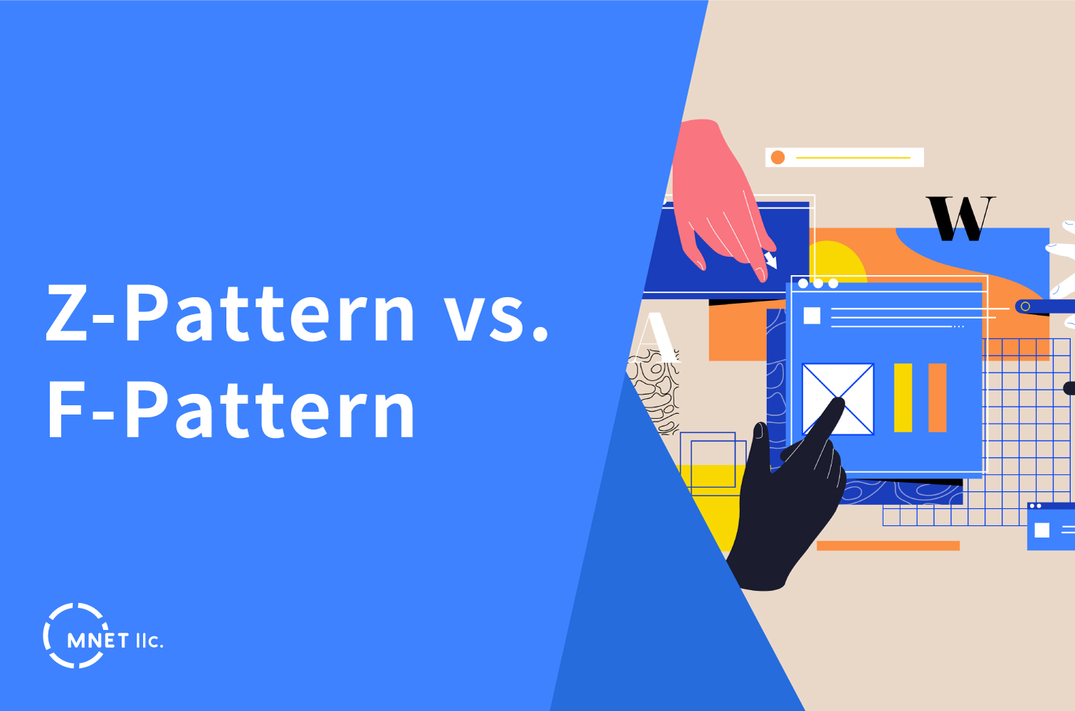
Understanding the principles of visual hierarchy is essential in creating effective and engaging web designs. By strategically organizing and prioritizing elements such as typography, images, and colors, designers can guide user attention, convey important messages, and improve overall user experience. A well-executed visual hierarchy can enhance usability and convey brand messaging effectively.
In web design, the Z pattern refers to the path that the human eye naturally follows when viewing content on a webpage. This pattern mimics the shape of the letter “Z” and has a significant impact on how users consume information. When a user lands on a webpage, their eye typically starts at the top-left corner (point A), moves horizontally to the right (point B), then diagonally down to the left (point C), and finally horizontally to the right again (point D). This path is driven by the natural inclination to read from left to right and top to bottom, as well as the tendency to seek out points of interest before moving on to the next area.

To optimize website layout for the Z pattern, designers strategically place important content or calls to action along this path, ensuring that key messages are seen and absorbed by users. Headlines, images, and navigation links are often positioned at points A, B, and C to capture attention and guide users through the content in a logical, engaging manner. By understanding and incorporating the Z pattern into web design, designers can create visually cohesive and user-friendly layouts that enhance the overall user experience.
The F pattern refers to the way in which users visually scan content on a webpage, creating an “F” shape with their eye movements. This pattern has been observed through eye-tracking studies and has deeply influenced the placement of content and design elements on websites. When users land on a webpage, their eyes typically first scan horizontally across the top of the page (the top bar of the “F”), digesting headlines and navigation links. As they move down the page, their attention shifts to the left side, creating the vertical line of the “F” pattern. This vertical scanning typically covers a shorter area than the initial horizontal scan. Subsequent horizontal scans occur further down the page, but with decreasing frequency and intensity, forming the second bar of the “F” shape.

To accommodate the F pattern, web designers strategically position important content along this path, placing key information, calls to action, and engaging visuals in the areas where users are most likely to focus their attention. By aligning content with the natural scanning pattern of users, designers can optimize the layout for better readability and engagement, ensuring that critical information is easily accessible and captivating.
In conclusion, visual hierarchy is fundamental in web design, ensuring that users can quickly identify and engage with essential content. By strategically organizing elements, designers guide users through the webpage, emphasizing the most critical information. This approach not only enhances user experience but also influences user behavior, driving attention to key messages and calls to action. Understanding and implementing visual hierarchy empowers designers to create more effective and compelling websites, ultimately contributing to increased user satisfaction and the achievement of website goals.
Click this link to learn more about the fundamentals of visual hierarchy.
Whether it’s creating captivating visuals, intuitive user interfaces, or cohesive brand narratives, we can bring your vision to life and set you apart in a competitive market.
At MNET, we aim to fulfill the needs, wants, and desires of our clients by utilizing our expertise in IT, Design, and Marketing. We continue to grow and keep up with the latest technological advancements and design trends in this ever changing world. We cater to all local businesses of all sizes.
If you’re looking for take your brand to the next level, contact us here!
Our Services Include:

ブランコ リカ
デザイナー
セブ工科大学で情報技術学科卒業。2019 年に日本語を勉強するために来日した。 グラフィック デザイナーとして自動車会社に入社し、テクノロジー業界の視野を広げ、グラフィック デザインへの情熱を追求した。 顧客に高品質のサービスを提供するという会社の使命とビジョンに感銘を受け、現在の会社に入社。

【ワードプレス】問い合わせフォームから届く、ひたすら迷惑なスパムメールを防ぐ為には?

長時間作業しても疲れない!?4スタンス理論から見る本当に自分に合ったマウスの選び方!


【Part7】記事取得のカスタマイズが捗る。WP_Queryの使い方。カスタムフィールドの指定編


サステナブルマーケティングとは


対面マーケティングの重要性


AIとグラフィックデザイン: デザイナーは心配すべきか?

Webサイト制作における開発手法


最近のマイブーム(おすすめメディア紹介)


幼稚園でICT活用のメリットを紹介


デジタルヘルスとは?
